
Equiballot
A platform to make voting equitable, accessible, and easy for candidates and voters.
ROLE
TEAM
UI/UX Designer
-Design user flow
-Design all interfaces
-Prototype and iterate
-Conduct usability testing
1 UI/UX Designer
1 Developer
2 Managers
TIMELINE
SKILLS
June - August 2024
User Research
UI Design
Communication
Usability Testing Prototyping
TOOLS
Figma
What I did
As the team’s sole designer, I produced 80+ screens and made sure to fully understand the U.S. political system as an international student to design with accuracy and context. This case focuses on the details of my end to end design of the Equiballot web app, from onboarding and the home screen to features for finding polling locations and delivering voter education.

Overview
Equiballot is a startup founded by Tufts Alumni Gaby Ackermann Logan and Katie Furey. Equiballot aims to address the inequity within the voting and campaigning process through designing an accessible app.
Problem Statement
How might we develop a personalized platform that identifies candidates across all positions and educates users about ballot details?
“It’s hard to know who to trust when researching candidates."
"I just want simple, reliable information about who’s running and what they stand for."
"I don’t always have the time to fact-check everything on my own."
Stakeholders
Voters
Individuals who use the app to access unbiased, fact-checked information about candidates and elections.
Candidates
Individuals running for office who need a platform to present their campaigns and connect with voters, especially those with limited resources.
Goals
Provide candidates a platform to directly communicate their campaigns
Simplify candidate research for voters and ensure voting decisions are based on well-informed information
User research revealed difficulties in identifying candidates across all positions and educating users about ballot details.

Ideation
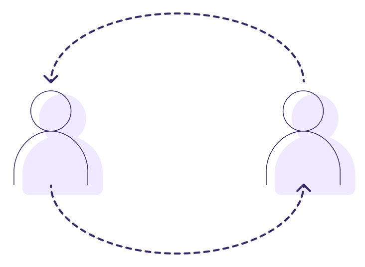
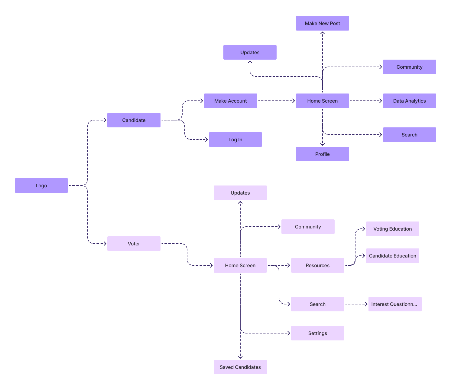
The user flow illustrates our approach to the app design. Upon entering from the main logo page, users are directed to two tailored pathways.
Candidates are guided through a streamlined experience, enabling them to create accounts or log in, after which they gain access to key tools such as data analytics for campaign insights, community engagement spaces, and search functionalities. The design emphasizes their ability to update profiles, share campaign milestones, post quotes, and interact directly with their voter base, fostering real-time engagement and increasing visibility on the platform.
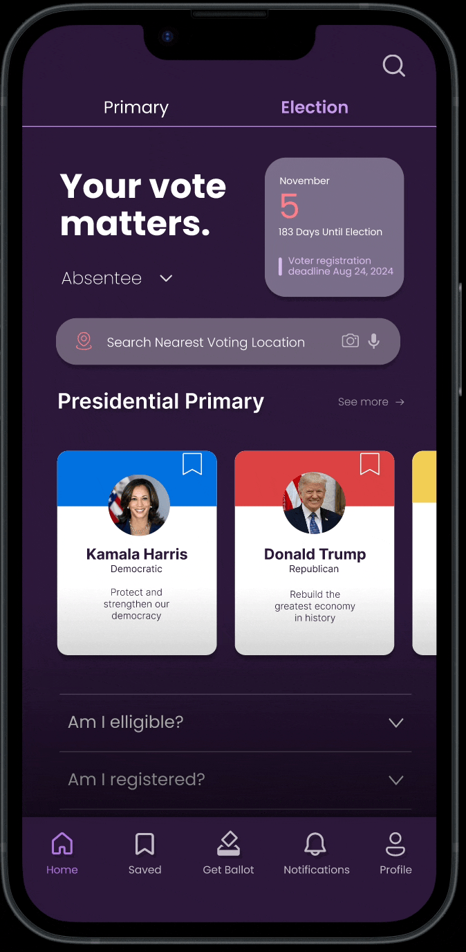
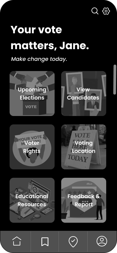
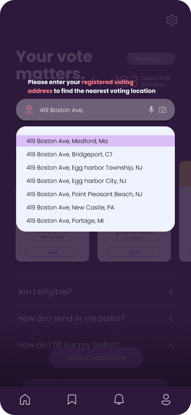
Voters, on the other hand, are provided with an extensive suite of resources to support informed participation in elections. After creating an account or logging in, voters can explore election updates, access candidate profiles, save preferred candidates, and search through tailored content. The app also offers educational resources, such as voting and candidate information, alongside community forums and personalized questionnaires that help users align their interests with relevant candidates. This holistic approach ensures voters are equipped with the necessary tools and information to make informed decisions.
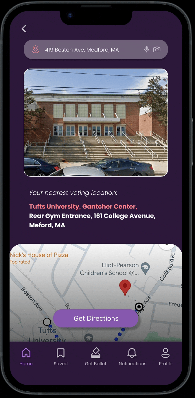
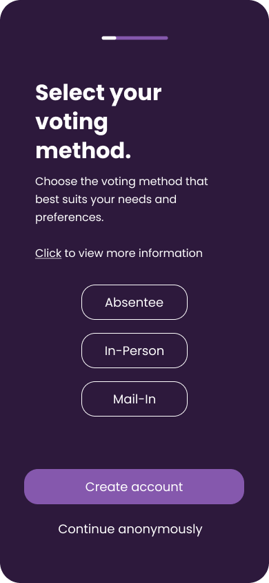
In the user flow above, I designed a visual representation of my ideas. After selecting either the voter or candidate pathway, users will be taken through an onboarding process, leading to a personalized home screen and app experience where they can share their political beliefs. During brainstorming sessions with my team, we discussed key features to enhance the app. They highlighted the importance of informing users about upcoming elections, voting rights, polling locations, and providing unbiased news and reports to offer a clear understanding of current polling trends.
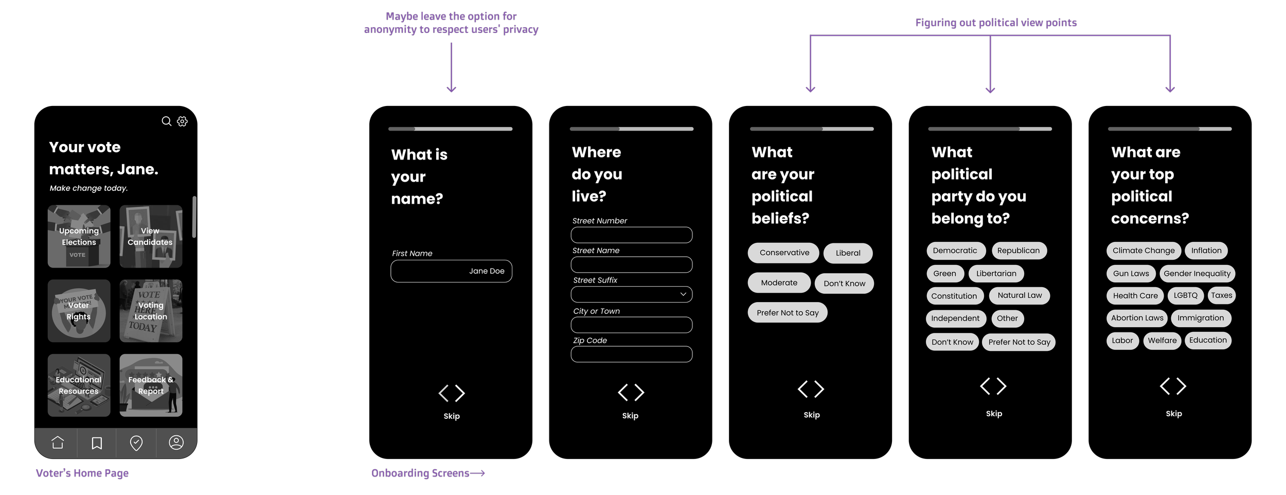
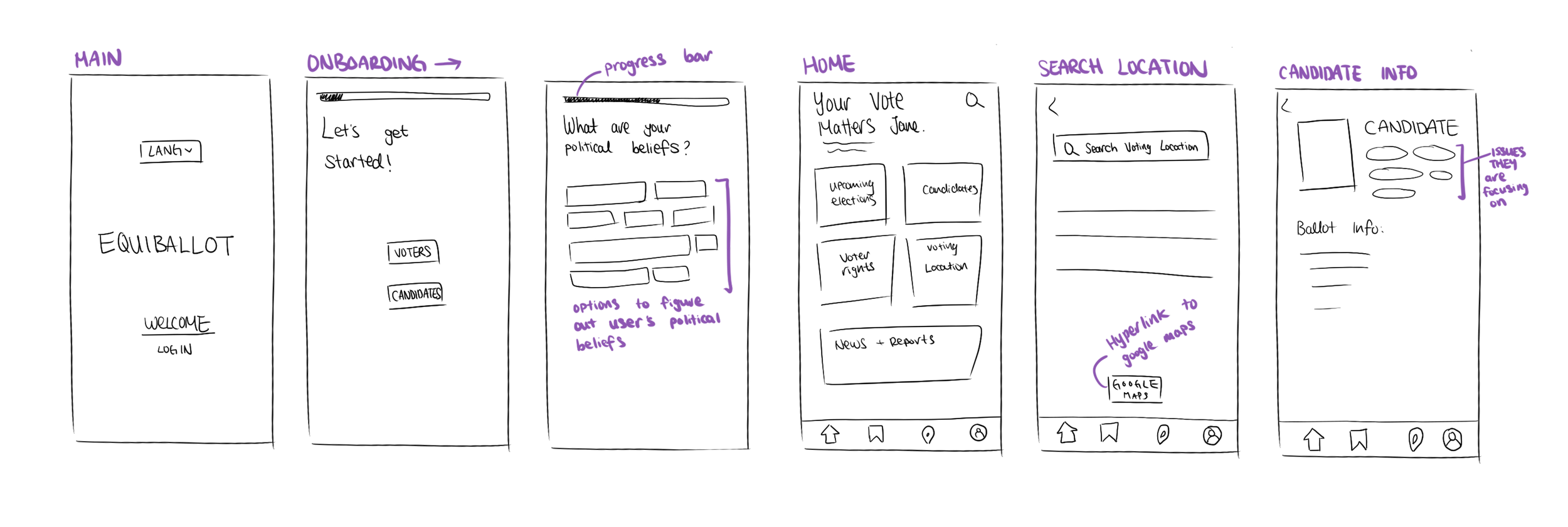
This refined ideation sketch, presented as a wireframe, provides a clearer depiction of the concepts my team and I discussed. We developed a set of questions to personalize the app experience further. However, there were differing opinions regarding whether users should be required to provide their real names, as politics and elections are sensitive topics, and many may prefer to remain anonymous.
Initial Designs

This design represents the initial concept we envisioned, where the chosen shade of purple serves as the primary color. Purple was selected for its symbolism of neutrality and balance, making it an ideal choice for a platform centered around political engagement. As a blend of red and blue—colors often associated with opposing political ideologies—purple conveys a sense of inclusivity and impartiality. This allows the app to foster a welcoming and unbiased environment, appealing to users across the political spectrum. The overall color scheme supports the platform's mission to encourage informed and balanced discourse in the political space.
Usability Test
Our goal was to make the app accessible to a wide range of users, including those with disabilities, limited tech experience, or different native languages. While Equiballot is designed for everyone, we focused this first iteration on engaging younger voters, as they have the lowest participation rates in U.S. elections. Our aim was to simplify and modernize the voting process in a way that resonates with young adults.
Method:
For each user, we evaluated how easily users can navigate through the app to perform key tasks such as selecting candidates, reviewing their saved choices, and checking their notifications. When developing the instructions and key tasks, we focused on using simple language as an attempt to prevent user errors and confusion with clear and concise instructions. The tasks survey the various features that we prototyped for this stage of usability testing. We also gathered feedback from users about their overall satisfaction with Equiballot, including their combined impression of usability, reliability, and trustworthiness.

User Tasks
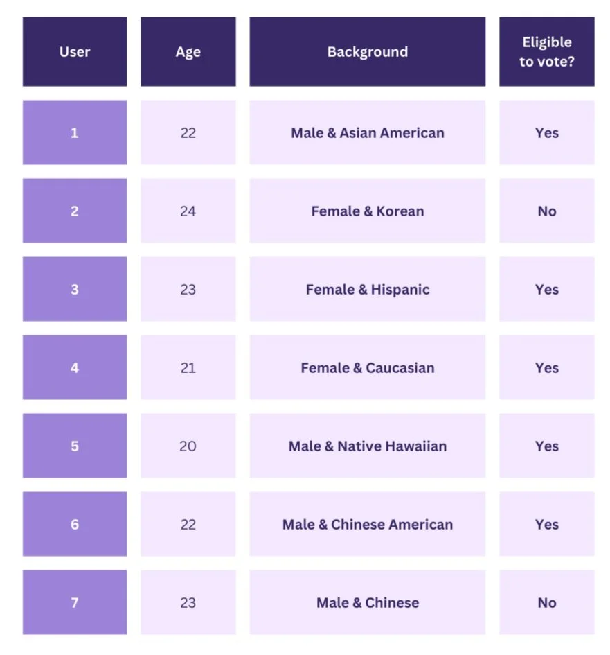
General User Information